Creating an invaluable educational resource from See Stories’ untapped video archives.
Overview
See Stories is an Alaska nonprofit that hosts youth filmmaking workshops. These workshops build confidence and expose students to career pathways in filmmaking. Over the years, they've produced hundreds of videos about the Alaska experience. Our team redesigned the See Stories site from stem to stern, paying special attention to the site's reimagined video library.
My Role
User Resarch, Information Architecture, and Visual Design Lead
This project was completed by a three-person team as part of a UX capstone project at the School of Visual Concepts. I collaborated closely with my partners Amanda (User Research Co-Lead, Usability, Project Management) and Ryan (Interaction Design, Prototyping) to redesign the See Stories website from stem to stern.
We each took ownership of different parts of the project. I owned user research with Alaska educators, information architecture, the video library, and overall visual design. In addition to those areas, I also assisted with usability testing and prototyping.
Problem
See Stories has hundreds of videos about Alaska, but no way to share them. Meanwhile, Alaska teachers desperately need local content for their classrooms.
Teachers from all over the US move to Alaska to start their teaching careers. Before they've barely settled in, these new-to-Alaska teachers are tasked with leading courses on Alaska state history. They have few resources to get up to speed and create lesson plans.
In the opposite corner, there's See Stories. The nonprofit has produced hundreds of videos about Alaska culture and history. But they don’t have a way to share them with educators.
Opportunity
How might we present See Stories’ video library in a way that empowers Alaska K-12 educators to create an engaging curriculum?
Solution
A sortable, searchable showcase for See Stories' video library to take center stage.
We designed a new video library for See Stories with Alaska educators in mind. Teachers can filter by class subject, topic, grade level, and more to find just the right video for their lesson plans.
Every video gets its own page with additional content to empower teachers to create inclusive and engaging curriculum from See Stories' video library.

Understanding the Users
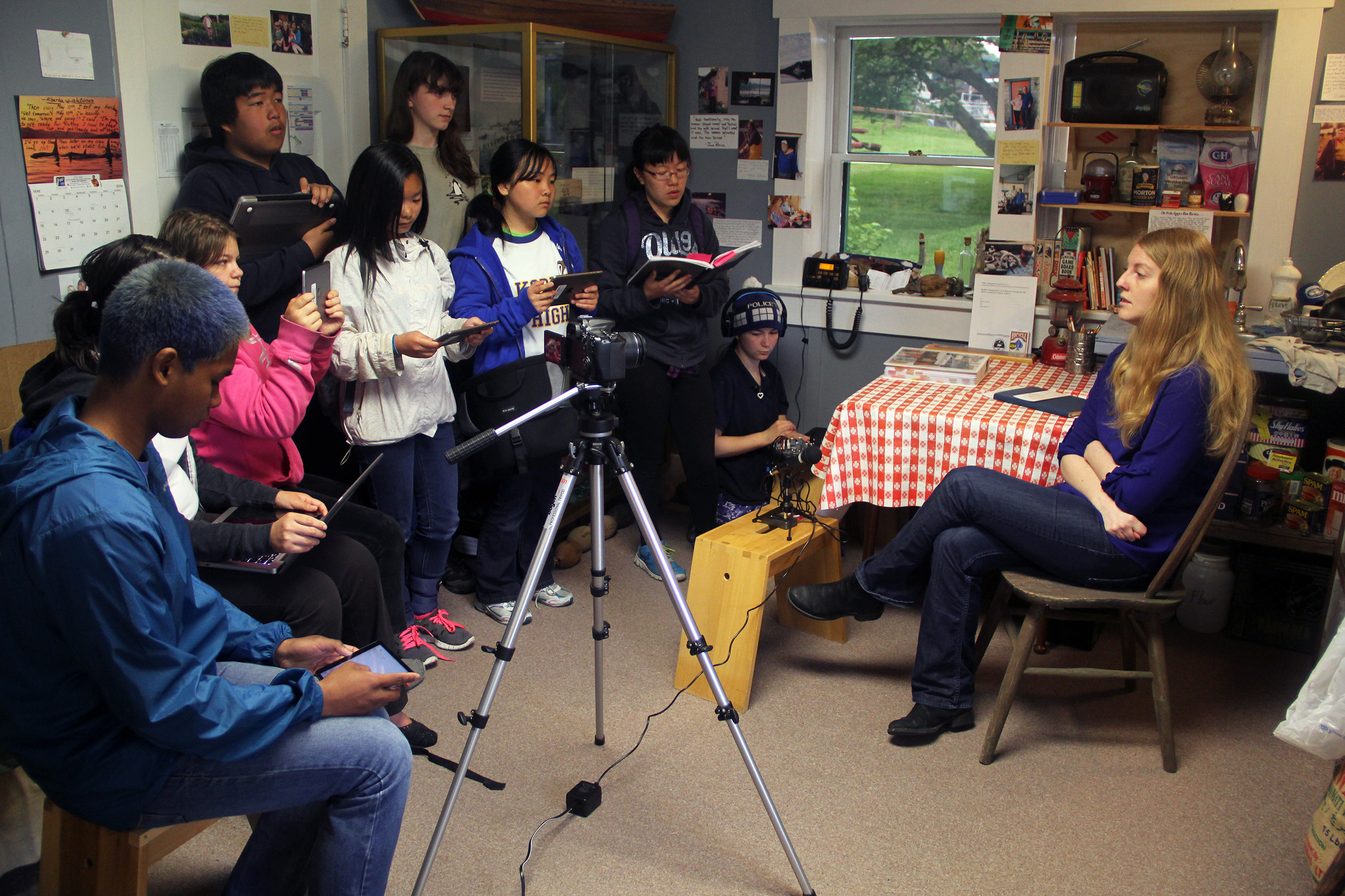
See Stories’ website is envisioned as a resource for Alaska K-12 educators. To better understand this unique user, I recruited and interviewed 4 educators from both urban and remote parts of Alaska. I asked participants to walk me through how they build lesson plans and how they incorporate video into their classrooms. We also discussed the unique challenges they face as teachers in Alaska.
Defining the problem
Insight 1:
See Stories' existing site structure didn’t make room for their massive video archive.
The few videos that See Stories had on its website weren’t presented in a way that made them useful to educators. The existing site used a static clickable “Story Map” of Alaska to present a grand total of 9 videos—a tiny fraction of their video archive.
In my initial user interviews with Alaska teachers, I showed this page to gather their impressions of the Story Map concept. All 4 of the teachers expressed that a map is not an effective way to find videos for use in their classrooms.
“If the Story Map is the only way to navigate videos, that’s a mistake. I need to be able to search videos by theme or topic.”
-Research Participant
“I wouldn't have known that the Story Map is how I look for videos that See Stories has made.”
-Research Participant

Insight 2:
Teachers need help understanding how a video fits into the bigger picture before they can use it in their classroom.
In my interviews, I aimed to understand how teachers find and incorporate videos into their teaching. Teachers mentioned that the two most important things they need in their search process are text descriptions and background information.
“Having background information on the video is important. We teachers tend to avoid topics when we aren't experts on it.”
-Research Participant
Insight 3:
Alaska History is a required course statewide, but teachers are on their own when it comes to finding resources and creating lessons.
See Stories’ founder told us that her nonprofit’s videos would be a perfect fit for a required middle school class called Alaska History. My interviews with teachers confirmed that there is a huge need for age-appropriate Alaska History content. 3 of the teachers also noted that Alaska History is always taught by teachers brand new to the state.
“A lot of our new teachers, they come to Alaska and don’t even know what the Exxon Valdez oil spill was. But that’s such a pivotal moment in our history.”
-Research Participant
“My husband is also a teacher, and he taught Alaska History one year. He had to make it up as he went, it’s not like there was a program for him to follow.”
-Research Participant
Design solutions
Idea 1:
Make the video library a clear part of the See Stories website architecture.
My heuristic evaluation of See Stories’ existing site revealed that its top-level nav suffered from unclear language. Users would have a hard time finding videos by clicking on “Story Map”, or workshops from the “Projects” page.

I led our team’s overhaul of the site’s architecture. I proposed that we prioritize 3 user flows in our top-level nav: browsing videos, signing up for workshops, and making a donation. To validate this new sitemap, we ran tree tests with 9 testers using Optimal Workshop. Testers successfully completed their tasks with an 89% success rate, giving us confidence to move forward with the new sitemap.

Idea 2:
Like Netflix, but for Alaska teachers.
Remember those hyper-specific Netflix categories? You know the ones: "Imaginative Time Travel Movies From The 1980s", or, "Understated Detective Shows From Scandinavia". We borrowed that idea of hyper-specific sorting to allow teachers to find just the right video for their students.
Teachers can filter and sort by a number of categories including class subject, theme, education standards, video duration, and more. Hat tip to my teammate Ryan for building out the interactions in Figma.

Idea 3:
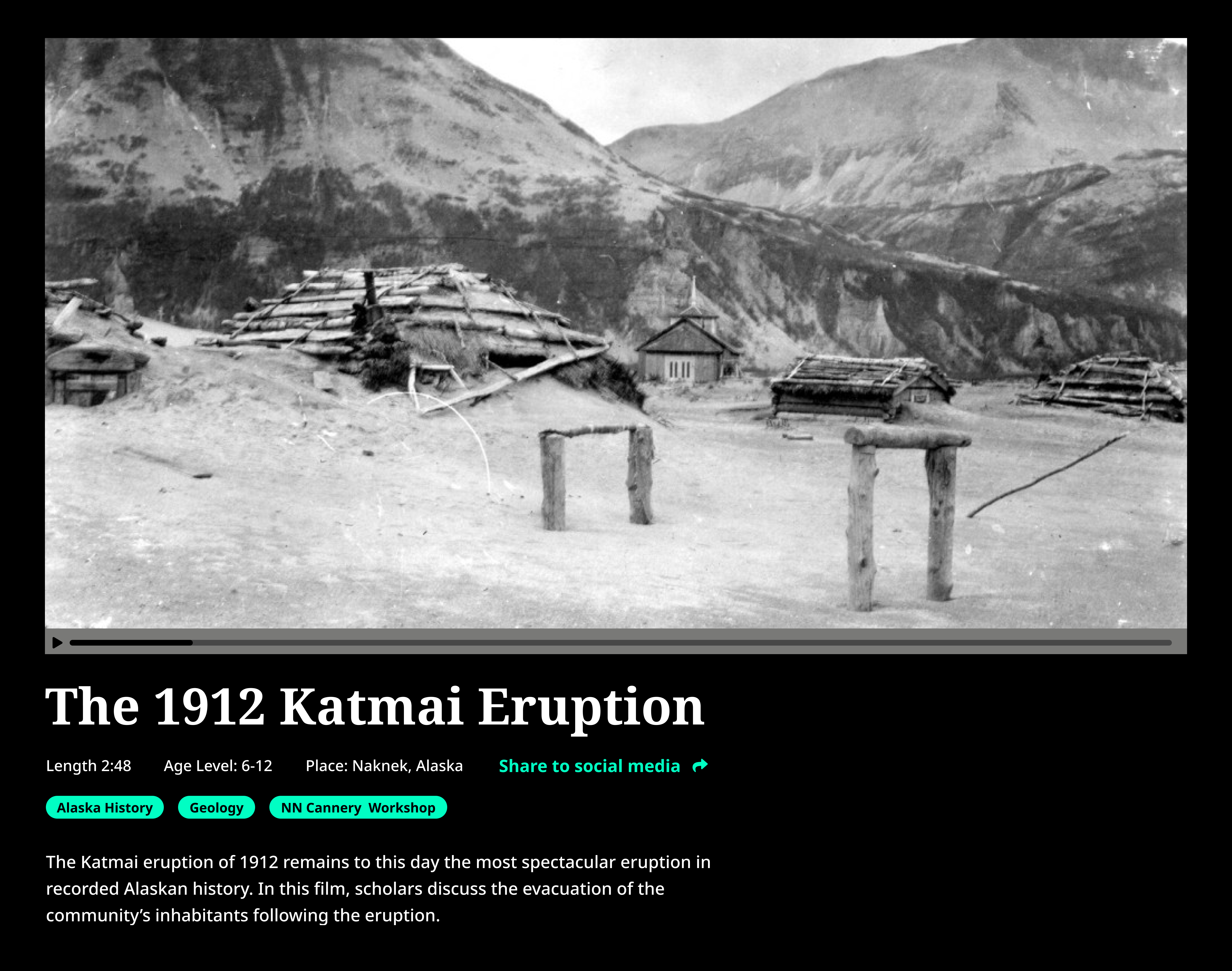
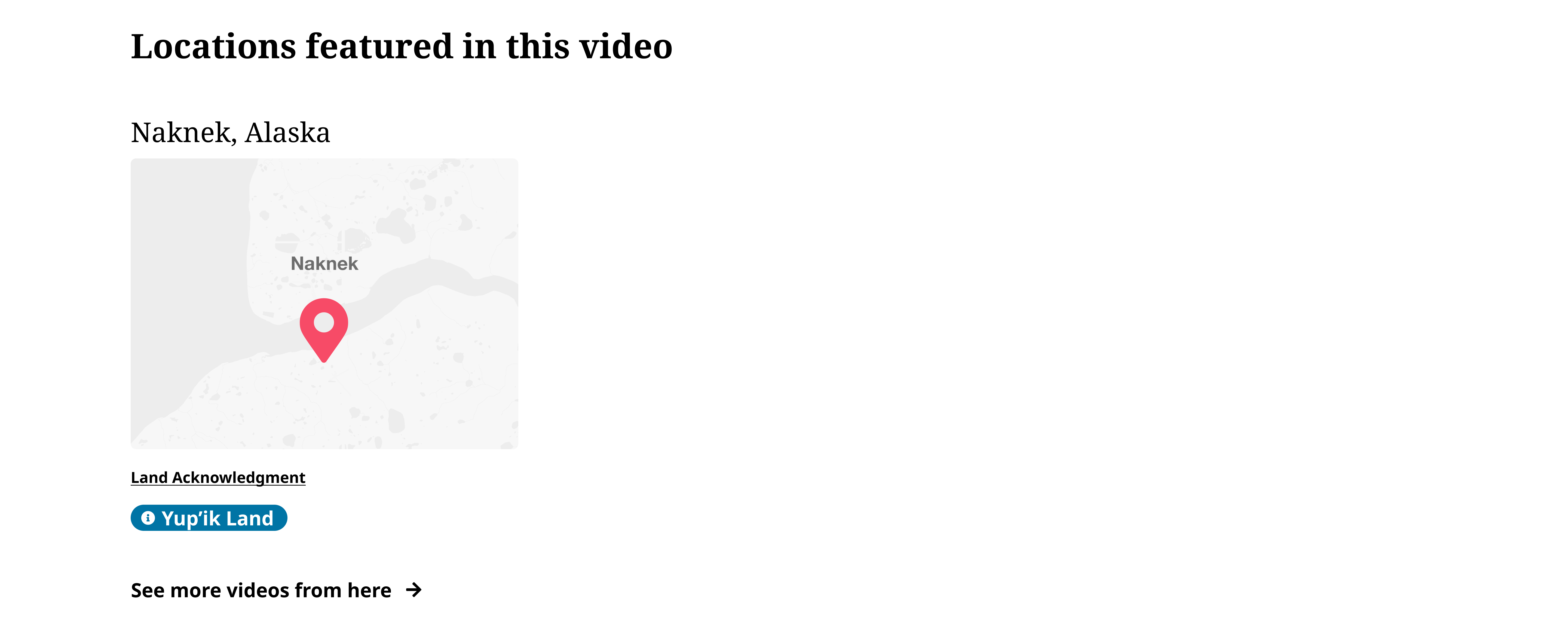
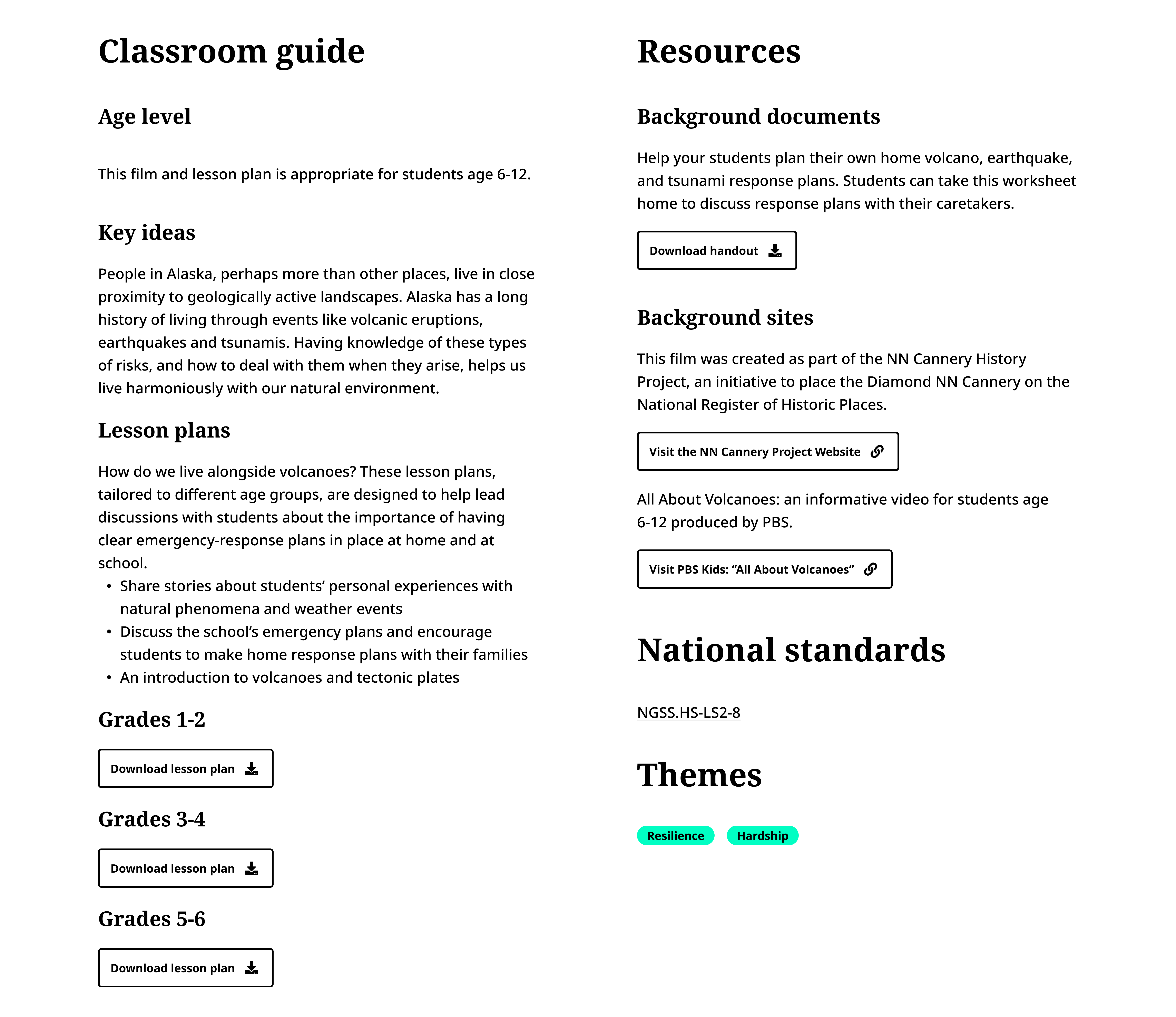
Give each video a page of its own.
My research indicated that teachers are more likely to use See Stories’ videos in their classrooms if they come with resources like background summaries and discussion guides. Interviews uncovered that teachers are often learning about Alaska along with their students. For these reasons, I designed a video page rich with important background information like maps, history primers, and more.

Let's walk through a sample video page from top to bottom:

Results
Process
Test. Refine. Repeat.
We went through a few iterations of the video library and video page before we landed on the high-fidelity prototype presented above. My partner Amanda and I ran a usability test of the Figma prototype with 8 participants. Only 2 of the participants were Alaska educators, with the remaining participants coming from related fields.
The two Alaska teachers who took part noted that the video page needed additional information to make it a useful educational resource. They mentioned that national curriculum standards and more age-appropriate content would be helpful additions for K-12 educators.
“What’s really important is that you have multiple guides for different grades. You would need at least two guides, or something to differentiate between younger and older students. If a high school teacher sees a guide that’s for fourth graders, they’re not going to go any further with this page.”
-Reseach Participant
The teacher participants in our usability tests encouraged us to find additional ways to make land acknowledgments across the website. I revised our mockups to include land acknowledgments anywhere a map appears on the website, in addition to a land acknowledgment in the footer.
“I think the map here is great. I know where Naknek is, but that’s a great feature for teachers who might not be familiar with Alaska.”
-Research Participant
“I feel wholeheartedly that no matter where you are in the United States you should be saying a land acknowledgment before any meeting or workshop. It’s so important. I'm wondering, why don’t you do one here [with the map]?”
-Research Participant


Outcome
"Thank you so much! Is it weird that I want to cry?"
—Marie Acemah, See Stories Founder
Tears of joy, of course. During our team’s final presentation, the client Marie was overjoyed as we shared our prototype website. “I’m just super excited by what you all created. The organization is unparalleled.”
We delivered a comprehensive set of recommendations for See Stories to transform their website into an invaluable resource for Alaska educators. The very next morning after our presentation, Marie took our design recommendations to an Anchorage-based web developer to implement. The new site should go live sometime in Summer 2022.
Reflections
Finding just the right people to talk to is time consuming, but so worth it.
Finding K-12 teachers from Alaska? That's tough. Finding Alaska K-12 teachers willing to talk to a stranger for 60 minutes? Now that's a tall order.
We had trouble recruiting research participants, and we briefly considered talking to teachers from other states. In the end, we interviewed just four Alaska teachers, but their insights are probably more valuable than what we would have learned talking to twice as many teachers from elsewhere. These teachers challenged some of our key assumptions about teaching in Alaska, and we learned from them invaluable findings that directed our design work.
The client brief is just a starting point.
The original brief from See Stories didn't say anything about their visual identity.
I realized early on that refreshing the group's visual identity could help empower their team to create better digital content. I reached out to the group's founder, Marie, to see if she would be open to such a radical proposal. To my delight, she said yes.
The revised palette turned out to be one of Marie's favorite parts of our recommendation package. The vibrant palette is informed by the colors of Alaska and reflects See Stories' youthful energy.
By going above and beyond what was asked of us in the brief, we showed our client that we were committed to their success. This went a long way toward strengthening our client's trust in our recommendations.

Explore more case studies:
Explore more projects:

Equinor Workplace
Building the future workplace for Norway's largest energy company.
Equinor Workplace
Lorem ipsum dolor sit amet, consectetur adipiscing elit. Suspendisse varius enim in eros elementum tristique. Duis cursus, mi quis viverra ornare, eros dolor interdum nulla, ut commodo diam libero vitae erat. Aenean faucibus nibh et justo cursus id rutrum lorem imperdiet. Nunc ut sem vitae risus tristique posuere.

Dantini Pizza
Growing a pandemic pizza pop-up into a successful brick and mortar pizzeria.
Dantini Pizza
Lorem ipsum dolor sit amet, consectetur adipiscing elit. Suspendisse varius enim in eros elementum tristique. Duis cursus, mi quis viverra ornare, eros dolor interdum nulla, ut commodo diam libero vitae erat. Aenean faucibus nibh et justo cursus id rutrum lorem imperdiet. Nunc ut sem vitae risus tristique posuere.
mama group
Putting the guest first at mama restaurant group.
mama group
Lorem ipsum dolor sit amet, consectetur adipiscing elit. Suspendisse varius enim in eros elementum tristique. Duis cursus, mi quis viverra ornare, eros dolor interdum nulla, ut commodo diam libero vitae erat. Aenean faucibus nibh et justo cursus id rutrum lorem imperdiet. Nunc ut sem vitae risus tristique posuere.

Pantori
Finding the right aisle is only half the battle; does it have to be so hard to find these international pantry items?
Pantori
–
Conceptual Project
,
2026
Lorem ipsum dolor sit amet, consectetur adipiscing elit. Suspendisse varius enim in eros elementum tristique. Duis cursus, mi quis viverra ornare, eros dolor interdum nulla, ut commodo diam libero vitae erat. Aenean faucibus nibh et justo cursus id rutrum lorem imperdiet. Nunc ut sem vitae risus tristique posuere.
mama group
Putting the guest first at mama restaurant group.
mama group
–
mama restaurant group
,
2026
Lorem ipsum dolor sit amet, consectetur adipiscing elit. Suspendisse varius enim in eros elementum tristique. Duis cursus, mi quis viverra ornare, eros dolor interdum nulla, ut commodo diam libero vitae erat. Aenean faucibus nibh et justo cursus id rutrum lorem imperdiet. Nunc ut sem vitae risus tristique posuere.
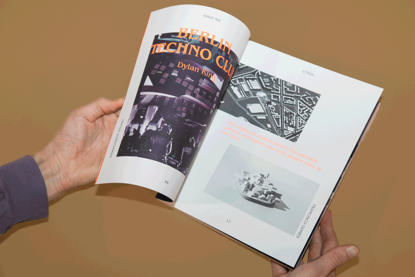
Issue 14
Setting a new creative direction for the School of Architecture's celebrated student publication.
Issue 14
–
University of Texas at Austin School of Architecture
,
2026
Lorem ipsum dolor sit amet, consectetur adipiscing elit. Suspendisse varius enim in eros elementum tristique. Duis cursus, mi quis viverra ornare, eros dolor interdum nulla, ut commodo diam libero vitae erat. Aenean faucibus nibh et justo cursus id rutrum lorem imperdiet. Nunc ut sem vitae risus tristique posuere.
Dantini Pizza
Growing a pandemic pizza pop-up into a successful brick and mortar pizzeria.
Dantini Pizza
–
Dantini Pizza
,
2026
Lorem ipsum dolor sit amet, consectetur adipiscing elit. Suspendisse varius enim in eros elementum tristique. Duis cursus, mi quis viverra ornare, eros dolor interdum nulla, ut commodo diam libero vitae erat. Aenean faucibus nibh et justo cursus id rutrum lorem imperdiet. Nunc ut sem vitae risus tristique posuere.
Equinor Workplace
Building the future workplace for Norway's largest energy company.
Equinor Workplace
–
frog
,
2026
Lorem ipsum dolor sit amet, consectetur adipiscing elit. Suspendisse varius enim in eros elementum tristique. Duis cursus, mi quis viverra ornare, eros dolor interdum nulla, ut commodo diam libero vitae erat. Aenean faucibus nibh et justo cursus id rutrum lorem imperdiet. Nunc ut sem vitae risus tristique posuere.

Sessions Curtain
A curtain inspired by the woman who brought the jacaranda to San Diego.
Sessions Curtain
–
Mingei Museum
,
2026
Lorem ipsum dolor sit amet, consectetur adipiscing elit. Suspendisse varius enim in eros elementum tristique. Duis cursus, mi quis viverra ornare, eros dolor interdum nulla, ut commodo diam libero vitae erat. Aenean faucibus nibh et justo cursus id rutrum lorem imperdiet. Nunc ut sem vitae risus tristique posuere.

Giraffe Chair
The Giraffe Chair is an ambiguous chair for uncertain times. It's more than a place to sit.
Giraffe Chair
–
The University of Texas at Austin School of Architecture
,
2026
Lorem ipsum dolor sit amet, consectetur adipiscing elit. Suspendisse varius enim in eros elementum tristique. Duis cursus, mi quis viverra ornare, eros dolor interdum nulla, ut commodo diam libero vitae erat. Aenean faucibus nibh et justo cursus id rutrum lorem imperdiet. Nunc ut sem vitae risus tristique posuere.
Pantori
Finding the right aisle is only half the battle; does it have to be so hard to find these international pantry items?
Pantori
–
Conceptual Project
,
2026
Lorem ipsum dolor sit amet, consectetur adipiscing elit. Suspendisse varius enim in eros elementum tristique. Duis cursus, mi quis viverra ornare, eros dolor interdum nulla, ut commodo diam libero vitae erat. Aenean faucibus nibh et justo cursus id rutrum lorem imperdiet. Nunc ut sem vitae risus tristique posuere.
See Stories
Creating an invaluable educational resource from See Stories’ untapped video archives.
See Stories
–
See Stories
,
2026
Lorem ipsum dolor sit amet, consectetur adipiscing elit. Suspendisse varius enim in eros elementum tristique. Duis cursus, mi quis viverra ornare, eros dolor interdum nulla, ut commodo diam libero vitae erat. Aenean faucibus nibh et justo cursus id rutrum lorem imperdiet. Nunc ut sem vitae risus tristique posuere.
mama group
Putting the guest first at mama restaurant group.
mama group
–
mama restaurant group
,
2026
Lorem ipsum dolor sit amet, consectetur adipiscing elit. Suspendisse varius enim in eros elementum tristique. Duis cursus, mi quis viverra ornare, eros dolor interdum nulla, ut commodo diam libero vitae erat. Aenean faucibus nibh et justo cursus id rutrum lorem imperdiet. Nunc ut sem vitae risus tristique posuere.
Giraffe Chair
The Giraffe Chair is an ambiguous chair for uncertain times. It's more than a place to sit.
Giraffe Chair
–
The University of Texas at Austin School of Architecture
,
2026
Lorem ipsum dolor sit amet, consectetur adipiscing elit. Suspendisse varius enim in eros elementum tristique. Duis cursus, mi quis viverra ornare, eros dolor interdum nulla, ut commodo diam libero vitae erat. Aenean faucibus nibh et justo cursus id rutrum lorem imperdiet. Nunc ut sem vitae risus tristique posuere.
Sessions Curtain
A curtain inspired by the woman who brought the jacaranda to San Diego.
Sessions Curtain
–
Mingei Museum
,
2026
Lorem ipsum dolor sit amet, consectetur adipiscing elit. Suspendisse varius enim in eros elementum tristique. Duis cursus, mi quis viverra ornare, eros dolor interdum nulla, ut commodo diam libero vitae erat. Aenean faucibus nibh et justo cursus id rutrum lorem imperdiet. Nunc ut sem vitae risus tristique posuere.
Dantini Pizza
Growing a pandemic pizza pop-up into a successful brick and mortar pizzeria.
Dantini Pizza
–
Dantini Pizza
,
2026
Lorem ipsum dolor sit amet, consectetur adipiscing elit. Suspendisse varius enim in eros elementum tristique. Duis cursus, mi quis viverra ornare, eros dolor interdum nulla, ut commodo diam libero vitae erat. Aenean faucibus nibh et justo cursus id rutrum lorem imperdiet. Nunc ut sem vitae risus tristique posuere.
Issue 14
Setting a new creative direction for the School of Architecture's celebrated student publication.
Issue 14
–
University of Texas at Austin School of Architecture
,
2026
Lorem ipsum dolor sit amet, consectetur adipiscing elit. Suspendisse varius enim in eros elementum tristique. Duis cursus, mi quis viverra ornare, eros dolor interdum nulla, ut commodo diam libero vitae erat. Aenean faucibus nibh et justo cursus id rutrum lorem imperdiet. Nunc ut sem vitae risus tristique posuere.
Equinor Workplace
Building the future workplace for Norway's largest energy company.
Equinor Workplace
–
frog
,
2026
Lorem ipsum dolor sit amet, consectetur adipiscing elit. Suspendisse varius enim in eros elementum tristique. Duis cursus, mi quis viverra ornare, eros dolor interdum nulla, ut commodo diam libero vitae erat. Aenean faucibus nibh et justo cursus id rutrum lorem imperdiet. Nunc ut sem vitae risus tristique posuere.