Putting the guest first at mama restaurant group.
Overview
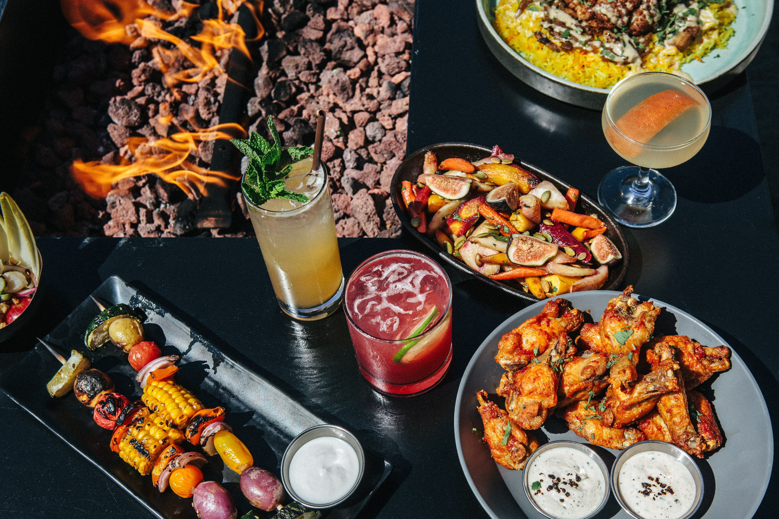
mama restaurant group operates six restaurants and counting in the Seattle area. From a falafel takeout window to the city’s buzziest rooftop cocktail bar, no two mama experiences are exactly alike. Our in-house team built a new website for mama that connects the group's brands and experiences in one place. And yes, everything in the "mamaverse" is lowercase.
My Role
Product Design Manager
I've worked on the restaurant group's new website for three months, launching the project ahead of opening two new locations. The Product Team at mama group is myself, one engineer, and one graphic designer—all of us wearers of many hats around the company.
I collaborate with company stakeholders including Marketing, Operations, and Cuisine to gather detailed business requirements that guide the project. I regularly lead workshops to build consensus and drive understanding among stakeholders. In addition, I work closely with leadership to set the product vision and strategy, leading weekly presentations to restaurant ownership.
Problem
mama's restaurant websites were hard for guests to use. The sites also didn't reflect the group's growth.
When a restaurant doesn't have their digital house in order, they risk losing potential guests. They also surrender their online experience to third parties like Yelp or Uber Eats.
mama restaurant group's websites weren't meeting the mark. We weren't providing guests with even basic requirements like a current menu, leaving them to find old photos of dinner menus on Yelp. In addition, the sites didn't reflect the group's growth from a a single restaurant to a constellation of six locations with a flourishing line of retail products.

Some of mama’s websites hadn't changed since 2009—the same year the iPhone 3GS came out and a year before Instagram launched. mama’s digital experience needed to be reinvented from the ground up.
Opportunity
How might we enable guests to quickly book a table or order lunch, all while supporting the restaurant group's growth?
Solution
All of the mamaverse under one roof.
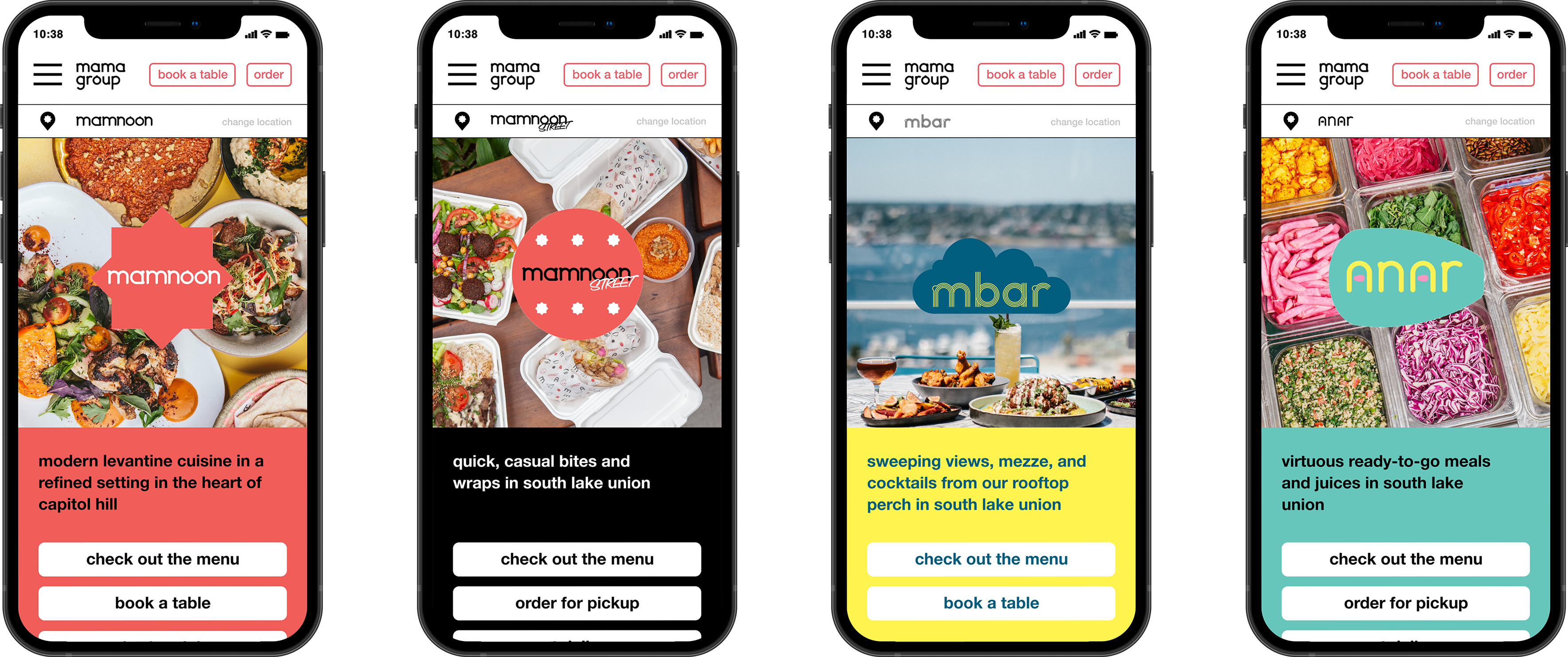
We designed a website that connects all the restaurants of the mamaverse. Guests can book a table, view menus, and order takeout for every restaurant in the restaurant group—all from one place.
We've rolled out a small percentage of what we've designed, and so far the results are promising. Negative guest feedback about the website has slowed to a trickle, and we receive fewer phone calls at the restaurants asking for basic information like service hours.

Understanding the Users
To better understand our guest's needs, I conducted a usability trial of the existing restaurant sites with 5 participants. Recruited from our own guestbooks, these testers provided invaluable feedback that set the trajectory of our work.
We also launched an emoji-based feedback scale at the bottom of every digital receipt. With this scale and feedback form, we tracked guest sentiment as we made incremental changes to the website.
Defining the problem
Insight 1:
Guests hated our websites.
Like, really hated them. Once we launched a feedback form on our sites and digital receipts, guests didn’t hesitate to tell us how they felt. The complaints were intense. This feedback helped to convince leadership that an overhaul of the restaurant sites was vital to the success of the company.

Insight 2:
The existing sites didn’t put guests first. Tasks like viewing a menu or placing an order weren’t always easy to complete.
Dense text, missing menus, confusing terminology; our online experience didn't pass muster. The most basic guest tasks—like understanding dinner hours—were difficult to complete.

Insight 3:
Guests didn’t know that our restaurants are part of one group.
As mama restaurant group grew, each new restaurant got its own website. But there was nothing that connected the restaurants together. Guests had to connect the dots on their own.
The group was missing out on an opportunity to cross-promote all the brands of the mamaverse.

Design solutions
Idea 1:
Put the guest’s goals first.
Guests can easily complete their most important goals like viewing a menu or booking a table from anywhere on the website using the sticky nav bar.

Idea 2:
A multi-location experience.
When a guest visits the website of their favorite mama location, they see that it's but one location in a collection of diverse dining experiences, planting a seed in guest’s minds to explore mama’s additional offerings.

Idea 3:
A common design template.
We made it simple to create a new restaurant site anytime the group opened a new location. Guests now have a consistent, predictable experience across all of the group’s locations.
Results
From 😡 to 😍: we flipped guest feedback from mostly negative to mostly positive.
We launched a beta version of the new website, tracking guest sentiment with a simple emoji-based scale on the bottom of every page and online order receipt. Before launching the new design, the most common response was a resounding 😡.
Since launching the new site, guest feedback is now overwhelmingly positive. Today, most guests leave a 🙂 or 😍to rate their experience.

Process
Building consensus: hosting a prioritization workshop.
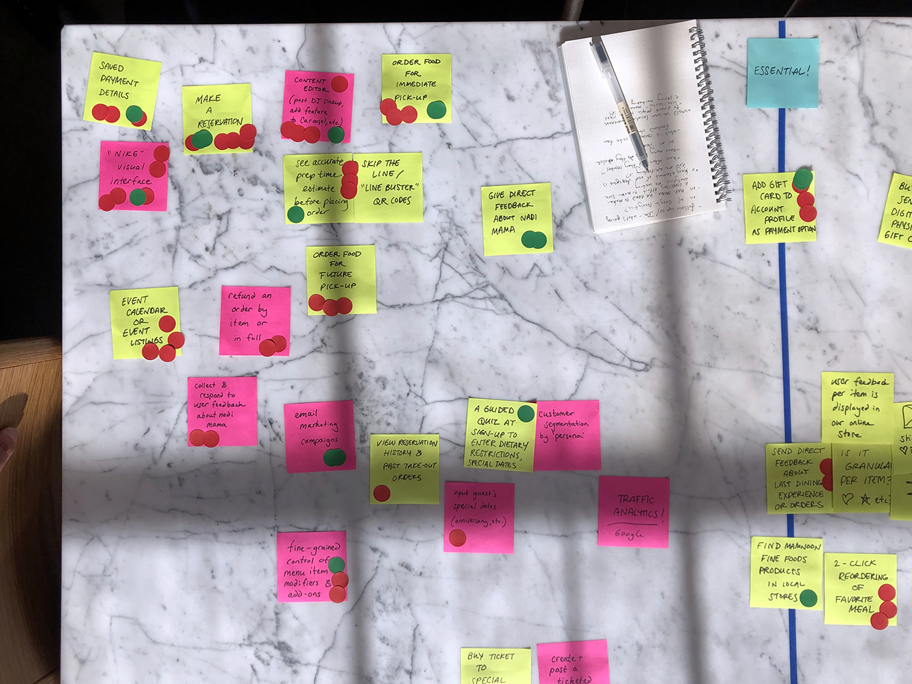
What are we going to build? Upon first joining the team, there wasn’t a roadmap or a clear, shared consensus of what the new website should be. What did it need to do for our guests? Our team?
I facilitated a dot-voting workshop to build consensus about features the site needed. And equally important, what it didn’t.

Collaborative design: paper prototype workshop.
After defining the features our new site would need, it was time to start prototyping. I facilitated key design decisions by leading the product team in a participatory design workshop.
Using paper, scissors, and markers, we generated a modular paper prototype on the fly. By sticking to paper, we were able to test and validate our ideas without investing too much time or effort.

Outcome
Validation: guest interviews and testing.
After we rolled out an early version of the new website, I interviewed 6 guests to gather feedback and run a short usability trial. All testers were easily able to complete all the most basic tasks like booking a table or viewing a menu.
The research showed that we were falling short in presenting our brand, with 5 of the 6 testers noting that there wasn't nearly enough food imagery on the site. Following this feedback, I'm planning to run a strategic content workshop with our stakeholders to create a plan for improving our use of photography group-wide.
Awareness of the mamaverse was growing!
In a big win for our goal of growing guest awareness of all our locations, 3 of the 6 guests interviewed said that they had learned about our restaurant group for the first time by visiting the site. Previously, those guests were aware of only the one restaurant they frequented.
I was only aware of mamnoon, I didn’t realize there were so many connected locations. That’s nice to know.
-Research Participant
I’ve seen anar because it’s next to mamnoon street. I know of mbar, but didn’t realize it was part of the group until now. I’ll have to go now that I know it’s one of yours!
-Research Participant
It's a work in progress.
This project remains ongoing as our small team tends to other technology and marketing needs in the company. As of May 2022, we have rolled out a small portion of what we've designed, but a larger roll-out awaits.
Reflections
It's hard to grow a UX practice on a team where there wasn't one before, but people notice the results.
I built a UX practice at mama restaurant group from scratch. Before, our solo engineer never talked to users or stakeholders before pushing out changes to the website. Important features were launched—without testing—to disastrous results. Over time, we created a culture of talking to the right people, gathering information, and testing. When we launch new features now, all the stakeholders are in the loop and our guests don’t face critical bugs.
User feedback forms can be a goldmine of data when you don’t have the resources for formal user testing.
User feedback from our simple emoji scale provided us with genuine qualitative data based on real consumer behavior. This simple feedback mechanism uncovered a huge number of bugs and usability issues that might not have otherwise been found. Even though the volume was small, this feedback became a goldmine of valuable data that informed our decisions every step of the way.
The sooner you launch, the sooner you have feedback. Enter: the pilot.
In addition to the front-end work you see here, we also built out a custom online ordering system that synced with our Point Of Sale system. We’d been burned by pushing updates that weren’t ready for primetime. Orders were failing to reach the kitchen, making for some unhappy guests and line cooks. We became cautious—too cautious—when it came to releasing updates and new features. This meant that we weren’t getting the important feedback we needed to inform our decision-making. So, we began utilizing our in-house restuarant teams as testers before unveiling new features to the public. This dramatically sped up the process of discovering and eradicating bugs and usability issues site-wide, and made for a much better product.
Explore more case studies:
Explore more projects:

Equinor Workplace
Building the future workplace for Norway's largest energy company.
Equinor Workplace
Lorem ipsum dolor sit amet, consectetur adipiscing elit. Suspendisse varius enim in eros elementum tristique. Duis cursus, mi quis viverra ornare, eros dolor interdum nulla, ut commodo diam libero vitae erat. Aenean faucibus nibh et justo cursus id rutrum lorem imperdiet. Nunc ut sem vitae risus tristique posuere.

Dantini Pizza
Growing a pandemic pizza pop-up into a successful brick and mortar pizzeria.
Dantini Pizza
Lorem ipsum dolor sit amet, consectetur adipiscing elit. Suspendisse varius enim in eros elementum tristique. Duis cursus, mi quis viverra ornare, eros dolor interdum nulla, ut commodo diam libero vitae erat. Aenean faucibus nibh et justo cursus id rutrum lorem imperdiet. Nunc ut sem vitae risus tristique posuere.
mama group
Putting the guest first at mama restaurant group.
mama group
Lorem ipsum dolor sit amet, consectetur adipiscing elit. Suspendisse varius enim in eros elementum tristique. Duis cursus, mi quis viverra ornare, eros dolor interdum nulla, ut commodo diam libero vitae erat. Aenean faucibus nibh et justo cursus id rutrum lorem imperdiet. Nunc ut sem vitae risus tristique posuere.

Pantori
Finding the right aisle is only half the battle; does it have to be so hard to find these international pantry items?
Pantori
–
Conceptual Project
,
2026
Lorem ipsum dolor sit amet, consectetur adipiscing elit. Suspendisse varius enim in eros elementum tristique. Duis cursus, mi quis viverra ornare, eros dolor interdum nulla, ut commodo diam libero vitae erat. Aenean faucibus nibh et justo cursus id rutrum lorem imperdiet. Nunc ut sem vitae risus tristique posuere.
See Stories
Creating an invaluable educational resource from See Stories’ untapped video archives.
See Stories
–
See Stories
,
2026
Lorem ipsum dolor sit amet, consectetur adipiscing elit. Suspendisse varius enim in eros elementum tristique. Duis cursus, mi quis viverra ornare, eros dolor interdum nulla, ut commodo diam libero vitae erat. Aenean faucibus nibh et justo cursus id rutrum lorem imperdiet. Nunc ut sem vitae risus tristique posuere.
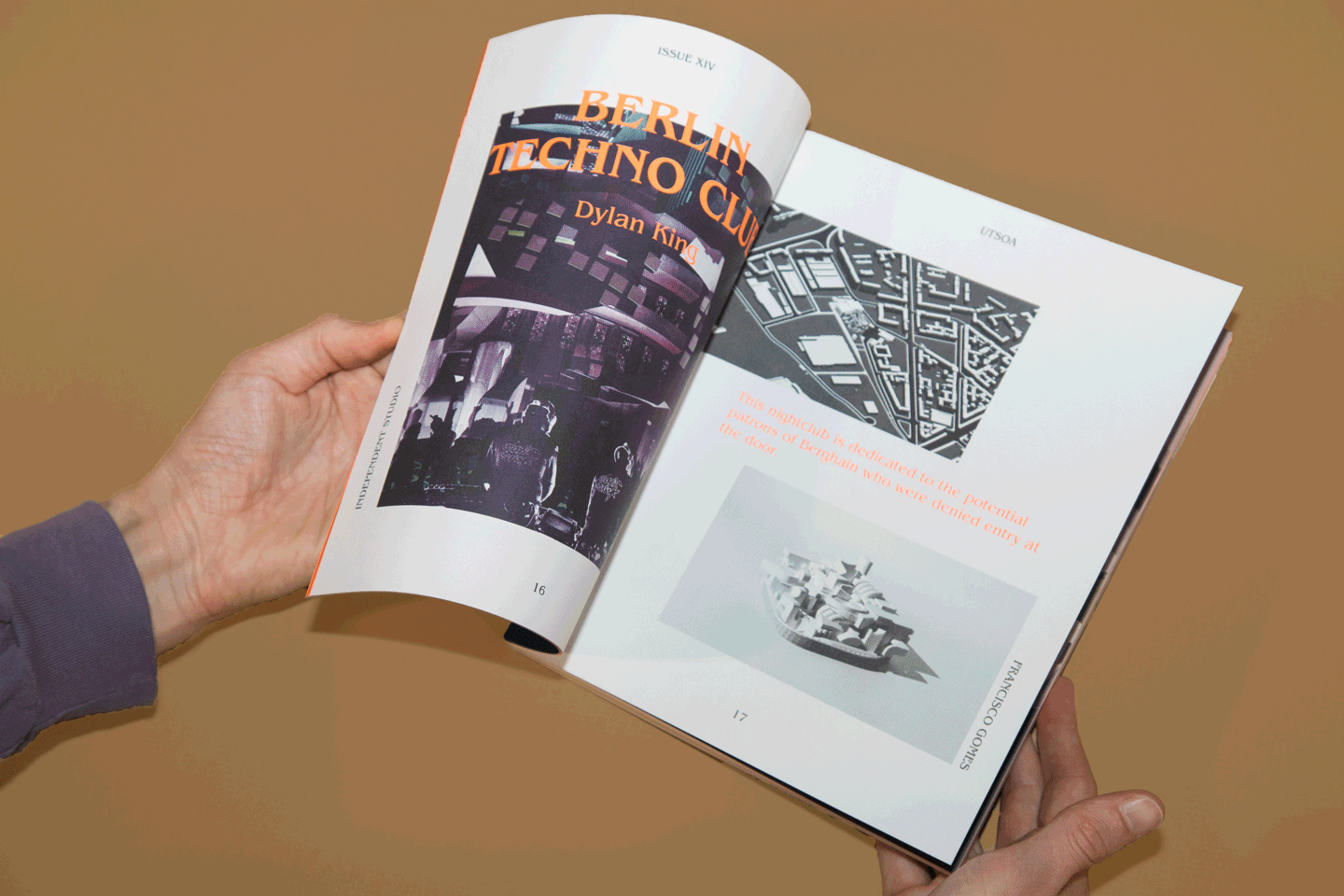
Issue 14
Setting a new creative direction for the School of Architecture's celebrated student publication.
Issue 14
–
University of Texas at Austin School of Architecture
,
2026
Lorem ipsum dolor sit amet, consectetur adipiscing elit. Suspendisse varius enim in eros elementum tristique. Duis cursus, mi quis viverra ornare, eros dolor interdum nulla, ut commodo diam libero vitae erat. Aenean faucibus nibh et justo cursus id rutrum lorem imperdiet. Nunc ut sem vitae risus tristique posuere.
Dantini Pizza
Growing a pandemic pizza pop-up into a successful brick and mortar pizzeria.
Dantini Pizza
–
Dantini Pizza
,
2026
Lorem ipsum dolor sit amet, consectetur adipiscing elit. Suspendisse varius enim in eros elementum tristique. Duis cursus, mi quis viverra ornare, eros dolor interdum nulla, ut commodo diam libero vitae erat. Aenean faucibus nibh et justo cursus id rutrum lorem imperdiet. Nunc ut sem vitae risus tristique posuere.
Equinor Workplace
Building the future workplace for Norway's largest energy company.
Equinor Workplace
–
frog
,
2026
Lorem ipsum dolor sit amet, consectetur adipiscing elit. Suspendisse varius enim in eros elementum tristique. Duis cursus, mi quis viverra ornare, eros dolor interdum nulla, ut commodo diam libero vitae erat. Aenean faucibus nibh et justo cursus id rutrum lorem imperdiet. Nunc ut sem vitae risus tristique posuere.

Sessions Curtain
A curtain inspired by the woman who brought the jacaranda to San Diego.
Sessions Curtain
–
Mingei Museum
,
2026
Lorem ipsum dolor sit amet, consectetur adipiscing elit. Suspendisse varius enim in eros elementum tristique. Duis cursus, mi quis viverra ornare, eros dolor interdum nulla, ut commodo diam libero vitae erat. Aenean faucibus nibh et justo cursus id rutrum lorem imperdiet. Nunc ut sem vitae risus tristique posuere.

Giraffe Chair
The Giraffe Chair is an ambiguous chair for uncertain times. It's more than a place to sit.
Giraffe Chair
–
The University of Texas at Austin School of Architecture
,
2026
Lorem ipsum dolor sit amet, consectetur adipiscing elit. Suspendisse varius enim in eros elementum tristique. Duis cursus, mi quis viverra ornare, eros dolor interdum nulla, ut commodo diam libero vitae erat. Aenean faucibus nibh et justo cursus id rutrum lorem imperdiet. Nunc ut sem vitae risus tristique posuere.
Pantori
Finding the right aisle is only half the battle; does it have to be so hard to find these international pantry items?
Pantori
–
Conceptual Project
,
2026
Lorem ipsum dolor sit amet, consectetur adipiscing elit. Suspendisse varius enim in eros elementum tristique. Duis cursus, mi quis viverra ornare, eros dolor interdum nulla, ut commodo diam libero vitae erat. Aenean faucibus nibh et justo cursus id rutrum lorem imperdiet. Nunc ut sem vitae risus tristique posuere.
See Stories
Creating an invaluable educational resource from See Stories’ untapped video archives.
See Stories
–
See Stories
,
2026
Lorem ipsum dolor sit amet, consectetur adipiscing elit. Suspendisse varius enim in eros elementum tristique. Duis cursus, mi quis viverra ornare, eros dolor interdum nulla, ut commodo diam libero vitae erat. Aenean faucibus nibh et justo cursus id rutrum lorem imperdiet. Nunc ut sem vitae risus tristique posuere.
mama group
Putting the guest first at mama restaurant group.
mama group
–
mama restaurant group
,
2026
Lorem ipsum dolor sit amet, consectetur adipiscing elit. Suspendisse varius enim in eros elementum tristique. Duis cursus, mi quis viverra ornare, eros dolor interdum nulla, ut commodo diam libero vitae erat. Aenean faucibus nibh et justo cursus id rutrum lorem imperdiet. Nunc ut sem vitae risus tristique posuere.
Giraffe Chair
The Giraffe Chair is an ambiguous chair for uncertain times. It's more than a place to sit.
Giraffe Chair
–
The University of Texas at Austin School of Architecture
,
2026
Lorem ipsum dolor sit amet, consectetur adipiscing elit. Suspendisse varius enim in eros elementum tristique. Duis cursus, mi quis viverra ornare, eros dolor interdum nulla, ut commodo diam libero vitae erat. Aenean faucibus nibh et justo cursus id rutrum lorem imperdiet. Nunc ut sem vitae risus tristique posuere.
Sessions Curtain
A curtain inspired by the woman who brought the jacaranda to San Diego.
Sessions Curtain
–
Mingei Museum
,
2026
Lorem ipsum dolor sit amet, consectetur adipiscing elit. Suspendisse varius enim in eros elementum tristique. Duis cursus, mi quis viverra ornare, eros dolor interdum nulla, ut commodo diam libero vitae erat. Aenean faucibus nibh et justo cursus id rutrum lorem imperdiet. Nunc ut sem vitae risus tristique posuere.
Dantini Pizza
Growing a pandemic pizza pop-up into a successful brick and mortar pizzeria.
Dantini Pizza
–
Dantini Pizza
,
2026
Lorem ipsum dolor sit amet, consectetur adipiscing elit. Suspendisse varius enim in eros elementum tristique. Duis cursus, mi quis viverra ornare, eros dolor interdum nulla, ut commodo diam libero vitae erat. Aenean faucibus nibh et justo cursus id rutrum lorem imperdiet. Nunc ut sem vitae risus tristique posuere.
Issue 14
Setting a new creative direction for the School of Architecture's celebrated student publication.
Issue 14
–
University of Texas at Austin School of Architecture
,
2026
Lorem ipsum dolor sit amet, consectetur adipiscing elit. Suspendisse varius enim in eros elementum tristique. Duis cursus, mi quis viverra ornare, eros dolor interdum nulla, ut commodo diam libero vitae erat. Aenean faucibus nibh et justo cursus id rutrum lorem imperdiet. Nunc ut sem vitae risus tristique posuere.
Equinor Workplace
Building the future workplace for Norway's largest energy company.
Equinor Workplace
–
frog
,
2026
Lorem ipsum dolor sit amet, consectetur adipiscing elit. Suspendisse varius enim in eros elementum tristique. Duis cursus, mi quis viverra ornare, eros dolor interdum nulla, ut commodo diam libero vitae erat. Aenean faucibus nibh et justo cursus id rutrum lorem imperdiet. Nunc ut sem vitae risus tristique posuere.